Cookie Preference Centre

We use cookies to enhance your website experience and help us identify any issues and areas for improvement. You can either "accept all" cookies or "manage preferences" to control the use of cookies. If you choose not to accept some cookies, please note you may experience a more limited functionality on our website. You can change your cookie preferences at any time.

Manage Cookie Preferences

A cookie is a small file containing just text, downloaded on to a device when a user accesses certain web sites. Cookies are useful because they allow a web site to recognise a user's device. Cookies allow us to store information related to your website visit which enables you to be shown relevant content to you while you’re browsing.

Cookies can also help us identify issues and improve the website, enhancing the experience for all users. We cannot identify individual users from these cookies. As well as the functionality below, you may be able to block the use of Cookies through your browser, please refer to our cookies policy for further information.

How colour theory shapes show home design

September 2026

Walking into a Story Homes show home, you’ll often notice how the space makes you feel before you recognise why; that’s the power of colour theory. From creating a sense of calm in a bedroom to encouraging conversation in an open plan kitchen/dining/family area, every shade has the ability to influence mood, enhance natural light and shape the way we experience a home. 

At Story Homes, every show home is thoughtfully designed to inspire. Working with the talented team at Show Business Interiors, we create bespoke interior schemes that are carefully curated to complement each house type, enhance its features and bring every room to life.  

Whether you’re drawn to warm, welcoming neutrals or rich, statement shades, understanding the principles of colour theory can help you decorate your Story home that not only looks good but also supports the way you live. In this guide, the SBI team explore how colour theory is used throughout our show homes, sharing the inspiration behind our interior schemes and practical ideas you can take into your own home. 

Colour theory for transitional interiors?

As the seasons change, so does the way we want our homes to feel. The lighter, fresher tones that work beautifully through spring and summer can begin to feel a little cool as the evenings draw in. Instead, introducing warmer, more muted shades can help create a home that feels inviting, comfortable and ready for the colder months. 

At its simplest, colour theory is the study of how colours work together to create a particular feeling or atmosphere. 

Creating warmth with a neautral palette

Neutrals are often thought of as purely understated, but they can have a huge impact on the atmosphere of a room.  

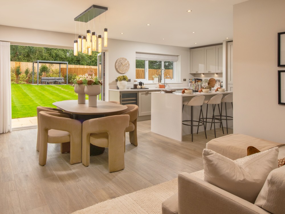
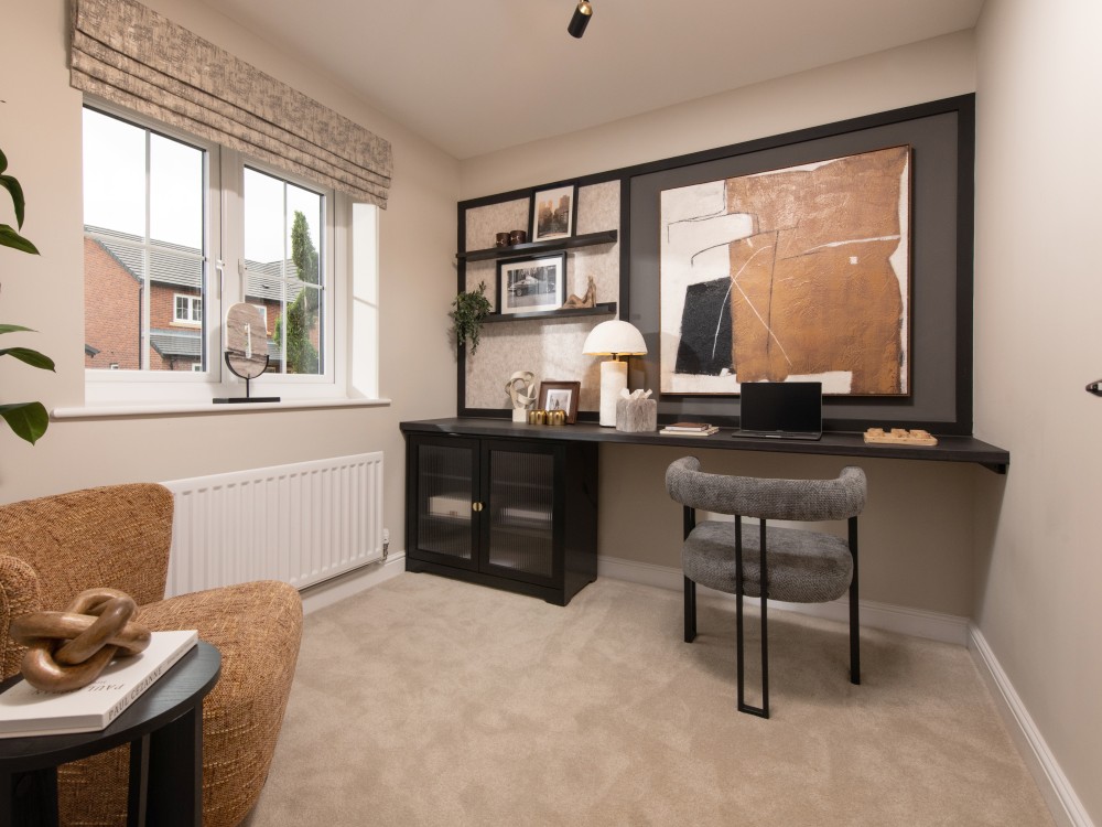
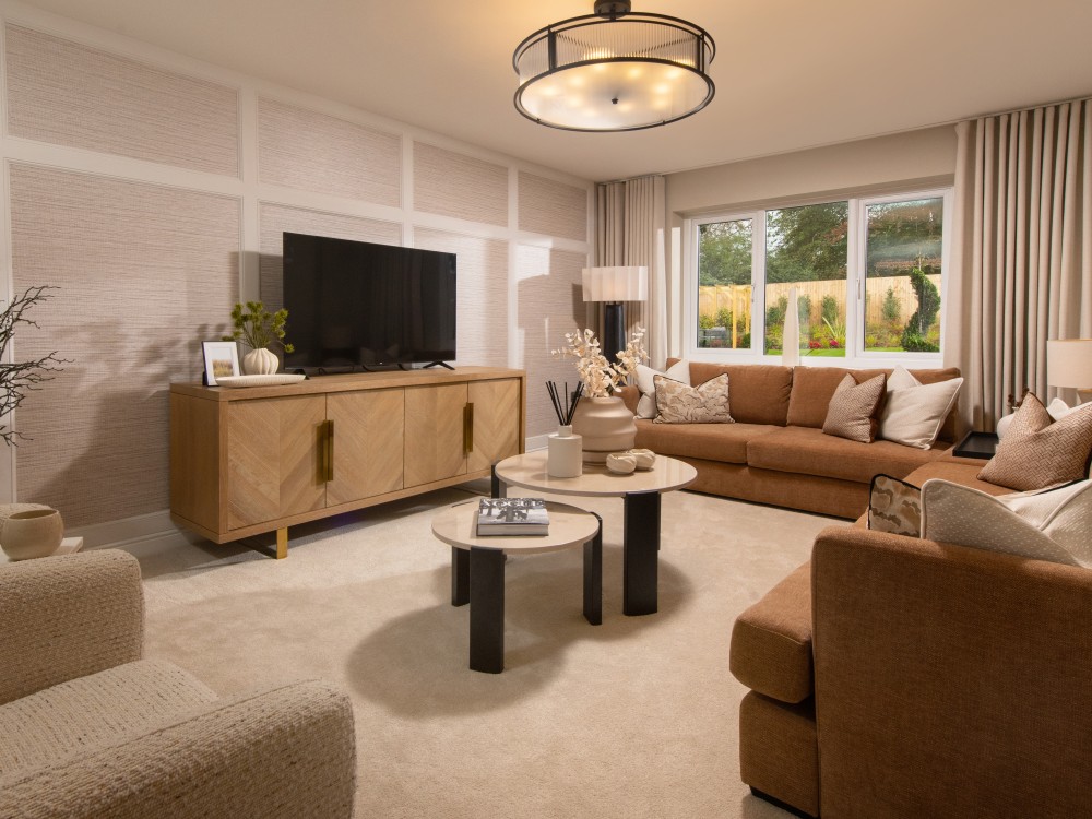
Throughout The Charlton at Woodbridge Green, a palette of creams, warm browns and burnt orange creates an inviting interior that feels particularly suited to the transition into autumn and winter. Rather than relying on one dominant colour, these shades are layered throughout the home, creating a cocooning effect. 

Layering warm tones through open plan spaces

Open plan living spaces benefit from a considered colour palette because the different zones need to feel connected. In The Charlton’s kitchen/dining/family area, soft brown upholstery, organic wood tones and fresh foliage work together to create a relaxed and welcoming environment. 

These elements demonstrate that warmth doesn’t have to come from colour alone. Materials, texture and natural finishes can all influence how we perceive colour within a space. 

Organic wood tones are particularly effective at creating a tactile feeling throughout a home. When paired with warm neutrals, they introduce subtle variation without disrupting the overall palette, helping the space feel cohesive. 
Introducing deeper shades for contrast

While a warm neutral palette creates the foundation, contrast is what gives an interior depth. 

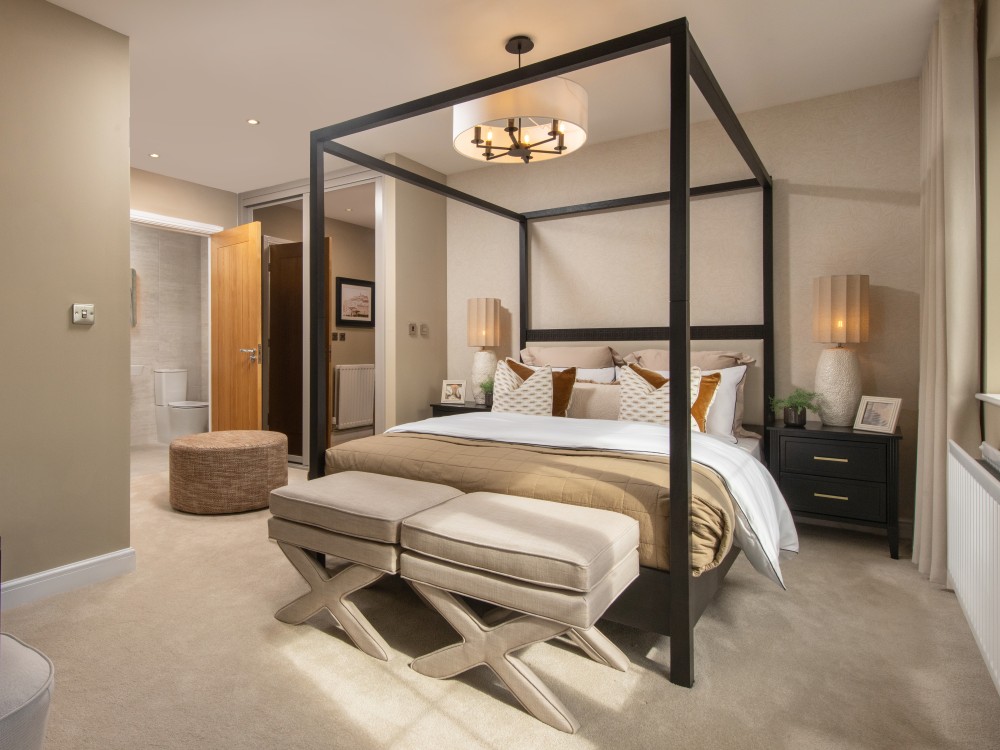
Throughout The Charlton, black accents are introduced. Used carefully, black provides definition and gives the scheme a more contemporary edge, preventing the warmer tones from feeling too traditional or overly soft. 

In the master bedroom of The Charlton, a black four-poster bed frame provides a strong focal point against a palette of neutral upholstery. Rather than competing with the softer colours, the black gives the room structure and definition, allowing the warmer tones to feel even softer by comparison. 

Ultimately, creating a home that’s transitional into the colder months it’s all about balance. By layering warm tones with organic textures and deeper accents, you can create a space that feels cosy, considered and yet still contemporary. 


Whether you’re refreshing a room or designing your entire home, colour has the power to transform how a space looks and feels. At Story Homes, every show home is thoughtfully designed in partnership with Show Business Interiors, with carefully curated interior schemes that inspire modern living and showcase the potential of every space. 

Visit one of our thoughtfully designed show homes to experience our interiors firsthand and discover how considered design and colour can help turn a house into a home.

Discover open plan living, designed the Story Homes way